
Hermex Travels- Turning Customers into Travelers.
Aug 23, 2025
5 min read
0
12
0

Introduction: Tools and Concepts
Hermex Travels, a travel agency founded in Nigeria, focuses on AI-driven travel solutions. The Hermex Travels team is planning to:
Incorporate VR features to assist travelers in navigating airports,
Use AI components to streamline the booking process.
Introduce a travel companion named Herssa to facilitate easy and essentially hands-free booking.
Offer a membership loyalty token, Hermex Tokens, which can reduce trip costs and function as a crypto bank.
Provide visa consultation appointments.
Together with a team of three colleagues, I worked on creating the web application and the smartphone apps for both Android and iOS.
Future goals:
offer activities to complement trips- like seasonal packages from local companies in the customers' home or destination countries.
Translation features
Weekend planer
My role: Lead UX/UI Designer
Challenge
Revise and update past research and screens using new information.
Goal
Develop a more comprehensive and efficient website by integrating AI and visa components for booking flights and hotels for both international and local travel.
Why is this important
When a trip is suggested, it can often lead to stress for both new and experienced travelers. From selecting the right dates to organizing transportation and accommodations, the excitement of travel can be diminished by the planning process. Hermex Travels strives to keep the adventurous spirit of exploring new experiences alive during the travel planning stages.
Tools Used:
Figma
Miro
Fig Jam

Problem Statement:
How can we create a comprehensive online travel agency that utilizes AI for booking strategies and incorporates stock options?
MVP (Minimum Viable Product): An online agency specializing in flights and hotels, using AI as the primary tool to ensure the most current booking information.
Additional Features | Future Updates |
|
|
These features effectively make Hermex Travels a comprehensive solution for both new and seasoned travelers, eliminating the stress of booking and saving for a trip.
Desk Research
I conducted competitive analysis on companies with similar feature that Hermex Travels want to implement.
What was found:
Many of these companies originated or primarily operate outside the United States and offer multilingual options and trip planning in the form of itineraries. Each company provides some type of predictive pricing, smart filters, and personalization.
From a marketing perspective, they maintain at least two social media accounts and are leveraging both website and app development.
What was found. | How can I use this information for Hermex? |
Many of these companies, primarily based outside the United States, offer multilingual options, itinerary-based trip planning, predictive pricing, smart filters, and personalization. | Loyalty points and stock options with easy capital conversion. |
From a marketing perspective, they maintain at least two social media accounts and leverage both website and application development. | Multi-city travel is an optional feature. |
My thoughts on the research
Some features within these companies might be overlooked because other features are more popular.
If Hermex prioritizes Herssa AI as a travel assistant/companion, having numerous features would simplify the traveler's experience.
Herssa would highlight these features, eliminating the need for the traveler or trip planner to search for travelers.
Reviewing existing work.
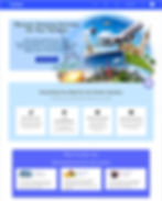
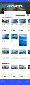
Beginning from left to right, we have the home page, the sign-in page, the new customer sign-up, and the flights landing page.
The earlier designs were not lacking; I had every intention of integrating them into the new design. The challenge I faced as a new UX team member was that none of the previous screens could be modified because they were full vectors rather than component-based groups.
I'm quite certain that pervious screens were downloaded from a different design platform and not adapted for Figma's design platform. This forced me to redesign the existing elements.
The Redesign
Minor Challenge
To comprehend the previous flow, I needed to create a map of what already existed.

The web app lacked significant development, and much of the necessary narrative to create an intuitive and well-rounded site was missing.
Initially, I needed to meet with the current team to understand the main features of the site and explain the necessary changes. Since the site was already live when I joined the Hermex team, we had to pause ongoing activities to allow me time to conduct user research and make adjustments.
I did do surveys and user interviews in order to fully understand how and what current users would expect from a site using Ai as a predicative feature.
Most of the data collected was expected:
Easy adaption to flights and hotel accommodation
up to date changes
easy revisions and alterations for main features
24/7 customer support for unexpected changes in travel
What I needed to include:
A chatbot and notification center.
Secure and customizable customer profiles.
A booking section for easy itinerary viewing.
Visa consultation scheduling for Schengen and general visas.
Later updates include:
An activities section for a complete travel experience.
A customer loyalty point system connected to Hermex which is crypto based (a Solana derivative).
Language translator
Most of the additions I plan to make will be included in future updates to ensure easy booking and efficient travel arrangements. Currently, we are concentrating exclusively on the MVP for flight and hotel bookings, with features that support these core areas.
Wireframes
 | The original navigation is at the top, while the updated and streamlined navigation is at the bottom. |
I leveraged user flows and the existing site map to help redesign the homepage navigation, using each navigation section to establish a clear path for users to follow. This was done to provide customers with a defined goal from start to finish with every action they take.
There were few subcategories in the navigation, except for the menu section, because I wanted users to understand that this was where they could personalize and view their inputs and requests made on the website. |  |
Every primary feature (flights, hotels, and activities) has its own dedicated landing page.

From this point, each area was linked to its specific flow, which was monitored by the Herssa AI chatbot to provide easy access to accommodation information.

Key take aways so far...
Since I had to work extensively on the website alongside the app creation, much of the testing had to occur after the application was completed.
Nonetheless, the knowledge I gained from building the website was comprehensive and could be readily applied to the app later.
I realized that not everything needs to be displayed on a screen. It's a basic understanding that I often overlook due to my focus on efficiency.
For users to remain on a page, it must be easy to navigate.
Ultimately, any feature can be integrated into a platform as long as it aligns with the MVP. Achieving this necessitates discussion and collaboration. If a feature cannot be clearly explained, it should not be included in the interface. In certain instances, it might be more appropriate for a different website or app.


