

RepRoom Gym: Virtual Class App
- wilse32
- Aug 25, 2024
- 5 min read
Updated: Oct 28, 2025
Introduction:
As fitness trends continue to evolve, local gyms are seeking new ways to engage members beyond the confines of their physical spaces. For a Seattle-based gym, transitioning from a purely web-based presence to a dedicated mobile app presented an opportunity to improve member retention, streamline class bookings, and foster a stronger sense of community.
This case study explores the gym’s journey from concept to launch, examining how the web-to-app conversion addressed challenges in user engagement, convenience, and personalized communication—ultimately creating a more integrated fitness experience for its members.
Challenge:
To take the existing website and reformat it into app-based platform for iOS and android
Goal:
To enable gym members to communicate effortlessly and access virtual classes and videos for solo workouts when visiting the gym is challenging, this change would facilitate both new and existing members to engage more actively with the gym, participate in online classes, and find technique information.
Why is this important?
Exercising can often feel isolating, as individuals step out of their comfort zones to engage with new people and activities. To support members in successfully adapting to lifestyle changes, it's essential to create a community platform that fosters comfort and connection with other members and coaches. This ensures that if someone decides to leave the gym, they won't lose the relationships and techniques they've developed.
Issue
How can I convert the web interface of RepRoom's virtual class into an app format, ensuring that users feel motivated and supported in their fitness journey?
Resolution
Create a user-friendly virtual class interface for iOS and Android apps, offering a platform for coaches and virtual participants to engage socially.
Objective
Identify pain points
Revamp website content
create an intuitive prototype.
Transform the community experience of gym life for both virtual and in-person members
Website Overview

Before starting any surveys or interviews, my aim was to understand the current usage of an existing website by using it as a reference.
I found that the website had a simple layout with a large movement library, but there were several areas that needed improvement for better user-friendly interaction.
Optional Feature Improvements:
The site required a community page to enable seamless communication among users.
Needed a clearer description of the required equipment and how it is used.
Furthermore, a 'movement library', filled with videos demonstrating techniques, required a simpler filtering system.
Initial User Survey

The initial surveys I developed aimed to gauge the opinions of both gym team members and potential clients outside the gym regarding online classes. One of the gym's owners mentioned that I referred to Peloton, as it was an app similar to the platform they envisioned.
I discovered that individuals who participate in virtual classes primarily do so for the flexibility they offer.
However, generating motivation and support independently is challenging, but once achieved, it propels them forward.
User Interviews
I interviewed three people to learn about their experiences with virtual workout classes.
As noted earlier, having a flexible schedule is essential for users. Interestingly, I found that motivation can be enhanced virtually by setting fitness goals established by the content creator over a certain timeframe. Users are more likely to commit time to fitness when they expect to achieve a result or attain a goal.
Factors such as diverse coaching styles and music offer initial motivation but are short-lived. The primary challenges concern the availability of equipment, especially for beginners. It's crucial to supply equipment or offer alternative exercises that don't need equipment.
An essential aspect is setting up communication channels between coaches and users to enable further accommodations when current options fall short, such as in situations involving new or existing injuries, fatigue, and similar circumstances.
Main Pain Points to Address

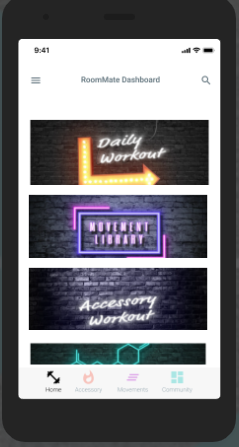
Numerous visibility problems, such as those encountered with the RoomMate Dashboard, were addressed through the app's compact size and intuitive design.
The app features a central navigation hub that allows users to easily access different sections, including the movement library and the community.
Providing access to gym coaches can create a supportive atmosphere for both new and current members.
Improving the user profile feature offers increased personalization and privacy, allowing users to establish and reach their own objectives.
Key Take Aways
Individuals take pleasure in belonging to communities. These groups provide motivation during exercise, making workouts fun and inspiring people to push their limits.
Establishing goals is crucial for exercising. They need not be overly ambitious, but they should help maintain accountability. This highlights the significance of having a community to build a supportive network.
Virtual classes provide convenience.
They can be done at any time, any place, at one's own pace without feeling pressured. Sometimes, people need solitude and the assurance that they are progressing at their own speed.
Website Site Map
At first, my goal was to confirm that the website fulfilled all the necessary criteria to meet the users' needs.
The website currently has a simple layout but requires a few adjustments, including:
Enhancing user information access,
Linking to social media on community pages,
Highlighting available free trials,
Providing a clear user login portal.
Additionally, any additional design recommendations for the app should primarily be based on surveys and user interviews.
.

Low Fidelity Wire Frames
I started with an intuitive website setup to ensure smooth navigation. The hamburger menu offers easy access to the user profile, store, and the option to email a coach.
The workout page includes videos, offering options for warm-up routines and additional accessory exercises for those aiming to enhance their workout experience.

User App Flow
My goal was to develop a more organized version of the website, making classes and supplementary workout components, such as warm-ups and accessory exercises, readily accessible. This design was crafted for the typical user, who does not need major modifications.

High Fidelity Wireframe

The app prioritizes classes, placing significant importance on community inclusivity. It was essential to ensure easy navigation and a user-friendly experience for both coaches and users. Although coaches may be enthusiastic in videos, their lack of presence in daily interactions can result in user isolation and a decrease in goal commitment.
Key Takeaways
During my process, I utilized the pain points to assist in making decisions. Users have distinct preferences and comfort levels, and my responsibility is to ensure these align well with the business needs.
In the final stages, I concentrated on refining the project to ensure it was inclusive and looked professional. I carefully reviewed all elements with a contrast tracker to resolve any accessibility and readability issues.
Creating an app for an existing website turned out to be a pleasant experience. Although much of the foundation is already in place, it's essential to spot any shortcomings from the previous interface. Simply maintaining the current state when moving to an app isn't sufficient; a UX/UI designer should improve a company's interface beyond its initial version.


Comments